
Taupe is a soft, sensuous shade, or neutral type color. It’s almost best described by saying what it’s not.
So, it’s not cream, or a beige. It’s not white, and it isn’t gray. Taupe is a neutral tone with tints somewhere between brown and gray, and it’s usually a bit darker than other neutral colors. Some compare it to the color of a mushroom bisque. And just like different batches of mushroom soup, taupe can come in all sorts of darker and lighter hues.
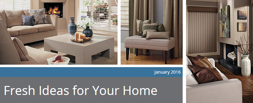
Taupe is chic, and sophisticated. It’s a neutral that goes with almost any style of interior design.
Most all shades of taupe go with:
-
Greens, like khaki and olive
-
Blacks
-
All other neutrals, such as white and cream
-
Chocolate brown
-
Gold
Some taupe’s can have a pink or lavender undertone, and these types of shades go well with dark pinks and violets, such as a burgundy and/or raspberry. Other versions of taupe have a cooler tone and go well with dark blues, aquas or teals. It’s wise to take the time and compare your taupe design elements with proposed purchases ahead of buying to make sure the colors complement each other.
Where can you use taupe? Think wall paint or an accent wall, window coverings, upholstery fabric, flooring, bed linens and more.
Consider the neutral taupe for an addition to your interior look and call Earth Care Window Treatments to help assist in the design with a new window treatment for your home.