
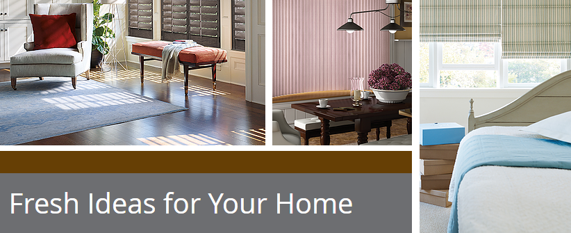
Try using these calming shades of pink and blue in your home interior design planning!
The Pantone Color Institute has selected Rose Quartz and Serenity as their colors of the year for home interiors. Every year, Pantone Color Institute selects a color that expresses a certain mood and an attitude for the year. For 2016, it’s the first time they have selected two shades as color of the year!
These soft shades of calming blue and serene pink help to make us feel more secure and at peace. When used in home decorating, they add to our sense of well-being and help to take away the daily stress of life in our own home environments.
“Joined together, Rose Quartz and Serenity demonstrate an inherent balance between a warmer
embracing rose tone and the cooler tranquil blue, reflecting connection and wellness as well as a
soothing sense of order and peace,” says Leatrice Eiseman, Executive Director of The Pantone Color Institute.
Whether you choose to use each color alone or use them together, this year think Rose Quartz and Serenity for upholstery and drapery fabrics, rugs and/or carpeting, paint, tile and back-splashes, or bedding and table linens, and accessories.
Soften your home this year by decorating in Rose Quartz and Serenity.
For help with the window treatments, call Earth Care Windows!